Skip to content
  • Work
  • Expertise
  • About
  • Contact
  • Work
  • Expertise
  • About
  • Contact

|

FEATURED WORK

34 DEGREES

FEATURED WORK

ADSWERVE

FEATURED WORK

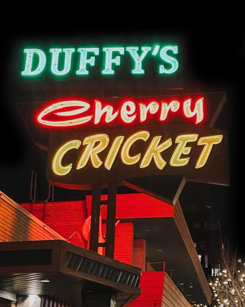
CHERRY CRICKET

FEATURED WORK

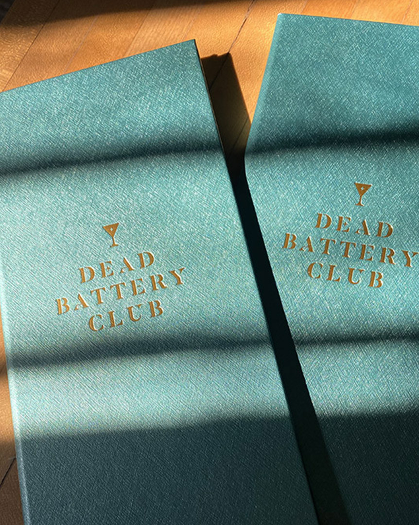
DEAD BATTERY CLUB

FEATURED WORK

FIX AFIB

FEATURED WORK

KEYSTONE RESORT

FEATURED WORK

KINSHIP CHOCOLATE

FEATURED WORK

DANONE

FEATURED WORK

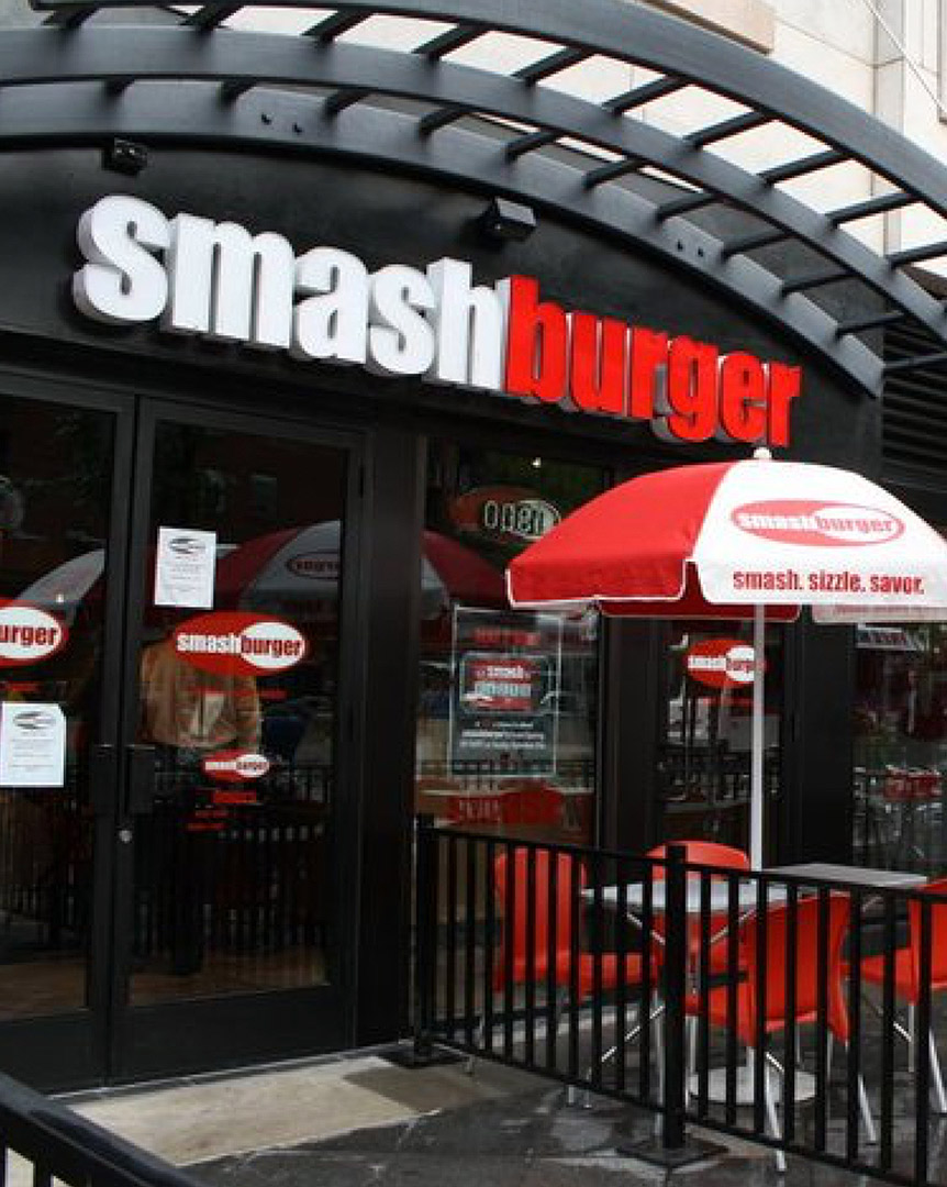
SMASHBURGER

FEATURED WORK

THE GOOD BEEF CO.

FEATURED WORK

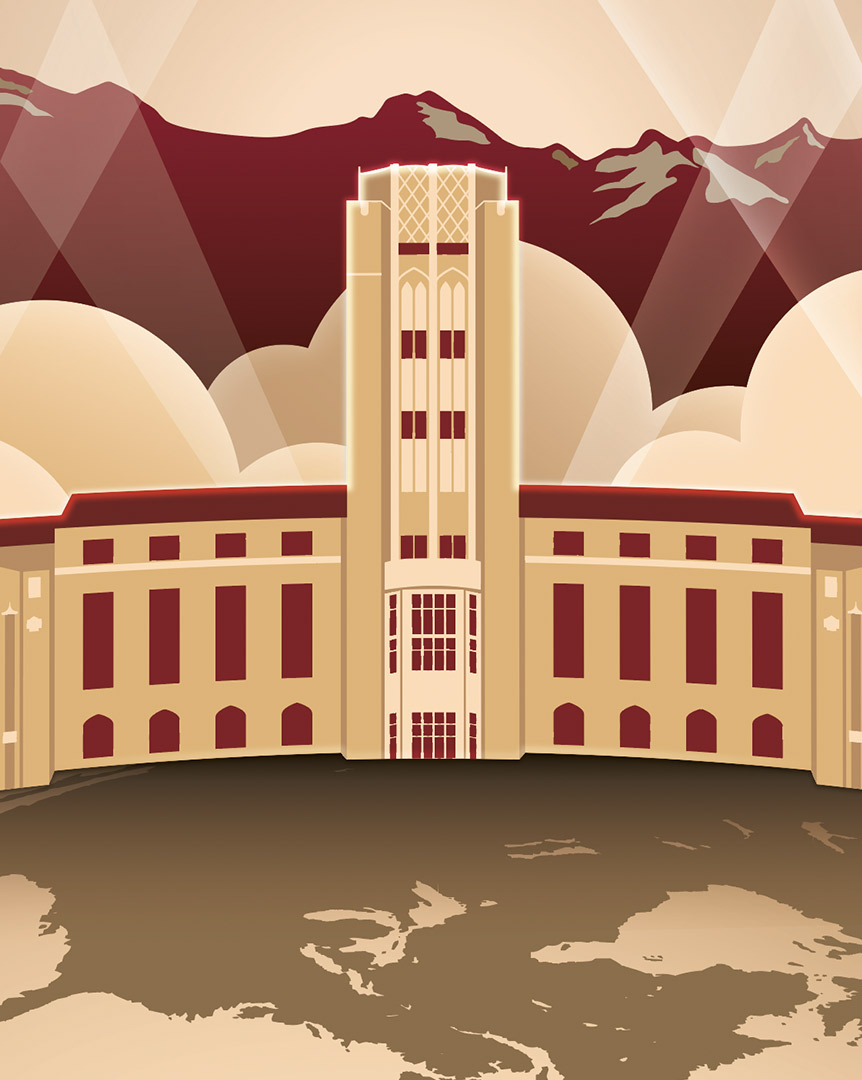
UNIVERSITY OF DENVER

FEATURED WORK

WAKEFIELD

FEATURED WORK

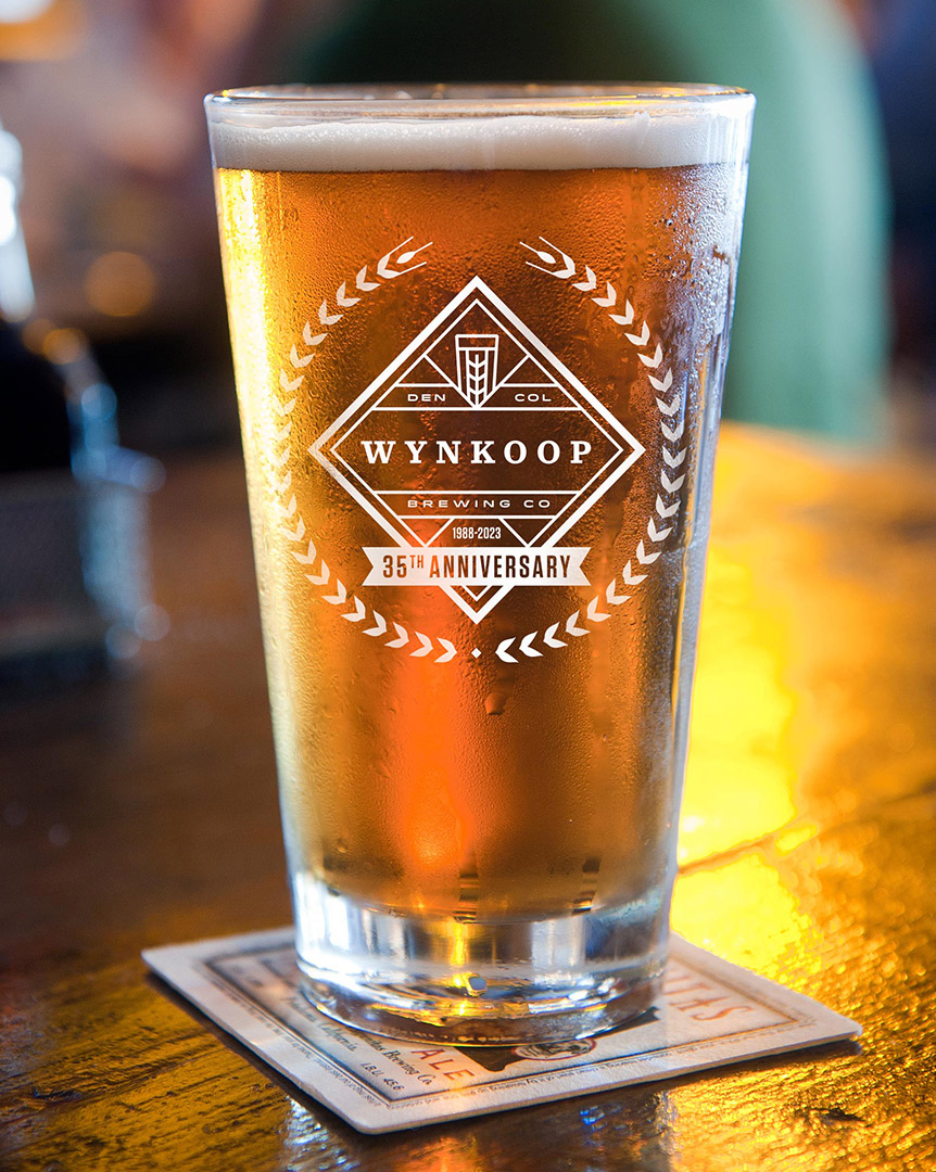
WYNKOOP

FEATURED WORK

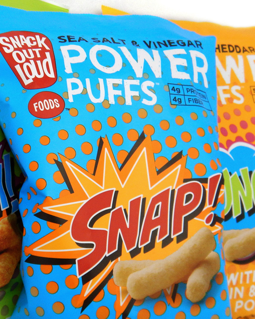
PACKAGING

FEATURED WORK

LOGOS
How Letterforms Carry Culture We talk a lot about How Letterforms Carry Culture

We talk a lot about what words say.
But what about what the letters say before you’ve even read them?

This piece from @print_mag had our attention because it puts language around something designers understand instinctively: type is never just a container for a message.

Letterforms can carry place. History. Identity. Politics. Memory. They can tell us where something came from, who it was made for, and whose voice we’re hearing.

Designer Daniel Irizarry’s @danielirizarry Between Worlds project takes that idea somewhere especially powerful, using typography to explore his Puerto Rican identity and the experience of the diaspora. The type isn’t decoration added after the story. The type is part of the story.

And in a design world increasingly built around systems, templates, algorithms and sameness, that feels worth paying attention to.

Because “clean” isn’t always neutral.
“Universal” isn’t always universal. And good design doesn’t have to sand away the things that make us different.

The most interesting work happens when we let those things show and when we fully embody them.
Worth the read - link in bio…
Hints of our fav colors found in Santa Fe. Hints of our fav colors found in Santa Fe.
💀 THE ONES THAT GOT AWAY 💀 Not every great idea g 💀 THE ONES THAT GOT AWAY 💀

Not every great idea gets to be THE idea.

When we build a brand identity, we explore. A lot. Different angles, different stories, different ways in. And inevitably, we create things we love that never see the light of day.

This restaurant concept, inspired by the history, flavors and culture of the Yucatán, gave us plenty.

Some clever. Some beautiful. Some with a little edge. All good answers to the same creative challenge.

One ultimately became the brand. But these? These are the ones that got away.

Because there’s rarely one great solution. That’s what makes the process so damn fun.
In a world overflowing with AI-generated images, p In a world overflowing with AI-generated images, polished templates, and increasingly predictable visual language, there’s something that has quietly shifted in the last year for design.

Wobbly lines. Handwritten type. Imperfect illustrations. Unexpected compositions.

It’s being coined as naive design.

But we don’t think the appeal is really about looking imperfect. It’s about feeling human.

After years of polished, perfectly aligned, highly produced visuals, there’s something refreshing about seeing the hand behind the work.

A little awkwardness.
A little personality.
A little evidence that someone actually made it with their hands. 

The irony?

The best “naive” design isn’t naive at all.

It takes a lot of intention to know what to leave imperfect. It has personality.

And maybe that’s why naive design is resonating. It reminds us that when creativity becomes “perfect” it also becomes forgettable.
Sometimes the thing that makes the work matter is the evidence that a human was there. Because after all, art has a fingerprint.
A brand built on heart deserves a future built for A brand built on heart deserves a future built for growth.

Cameron’s Chocolates was founded by Cameron’s parents to create meaningful employment opportunities for adults with intellectual and developmental disabilities through Every1 Can Work. 

As the business prepared to expand into new retail channels, it needed a brand that reflected both the quality of its products and the heart behind its mission.

We evolved the identity with a more elevated, contemporary feel while preserving the heart hidden within the logo, a tribute to Cameron’s original sketch. The result is a flexible brand and packaging system designed to grow with the business while honoring where it all began.

These new snack pouch designs are the first step in that evolution, helping more people discover products made by extraordinary people. ♥️
The best creative partnerships feel like a true ex The best creative partnerships feel like a true extension of your team.

That’s exactly what we strive for at Mad Studio.

We’re not interested in simply checking creative projects off a list. We want to understand the business, the people behind it, the goals, and what success for you, actually looks like.

We couldn’t ask for a better reflection of the kind of partnership we want to build.

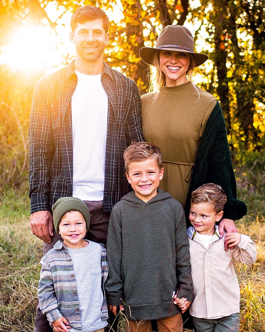
Thank you, Julie, and the Rachio team, for trusting us to be part of yours.
Facebook Instagram Linkedin
© 2025 Mad Studio. All Rights Reserved.

INFORMATION

Services

Work

About

Contact

CONTACT US

704 443 6624

info@Mad-Studio.com

Have a Project
in Mind?

Contact Us

CONTACT US

720 443 6624
info@Mad-Studio.com

Facebook Instagram Linkedin